Sandman is an rest and relaxation brand made to enhance your quality of life through intentional, innovative sleep solutions
2024 — An independent branding project
2024 — An independent branding project
Creative Direction
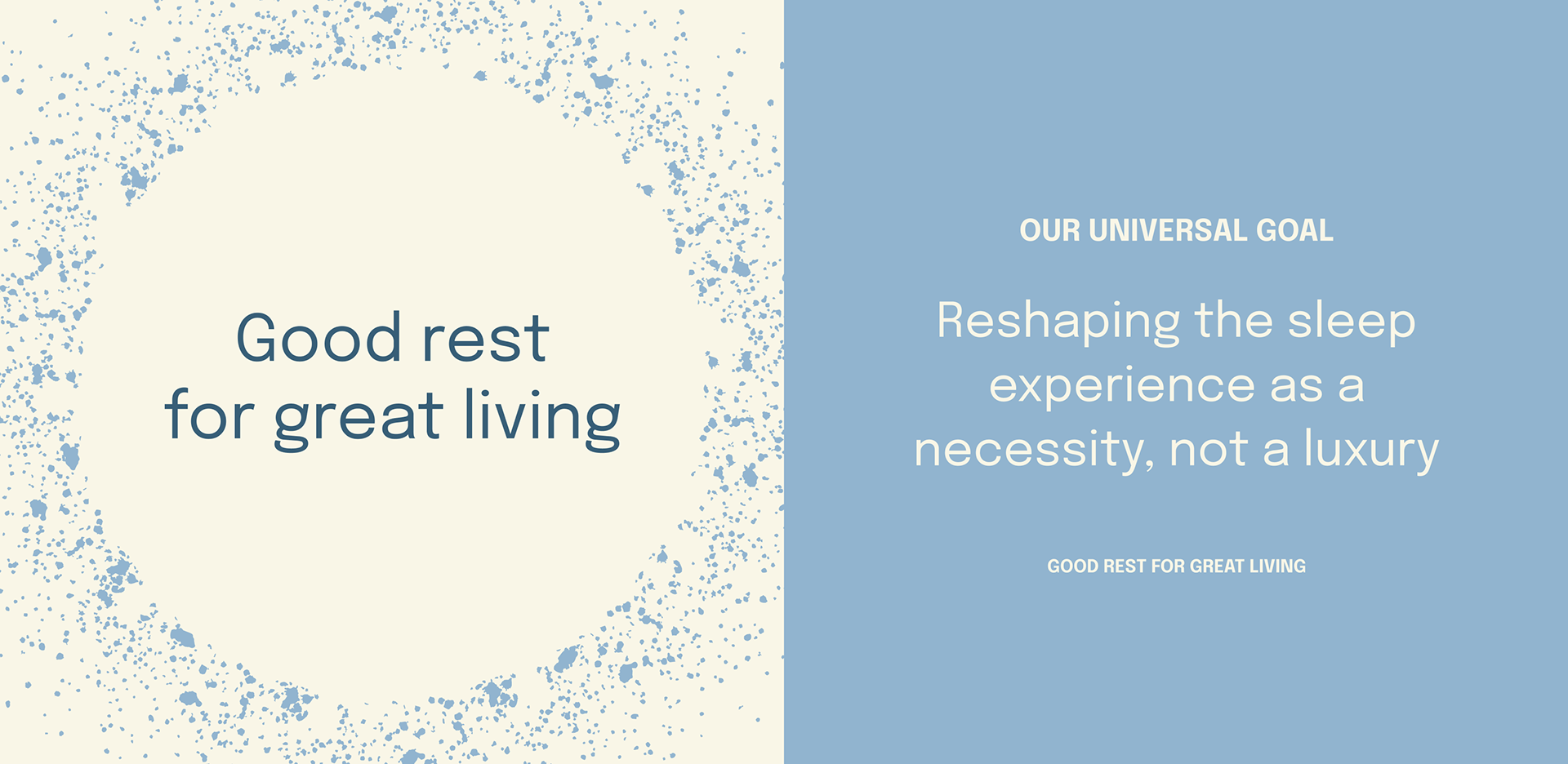
Sandman’s creative direction highlights the sands of time; the state of presence. The brand is all about time and presence as a valuable part of our day to day, elevated by the gift of sleep.
BRIEF
The clients approached me with a strong vision and mission for Sandman. Their brand's strategy highlights tranquility and peace—how good sleep takes you to greater heights. They asked me to provide a creative direction and brand identity that aligns with their goal to redefine the sleep experience.
APPROACH
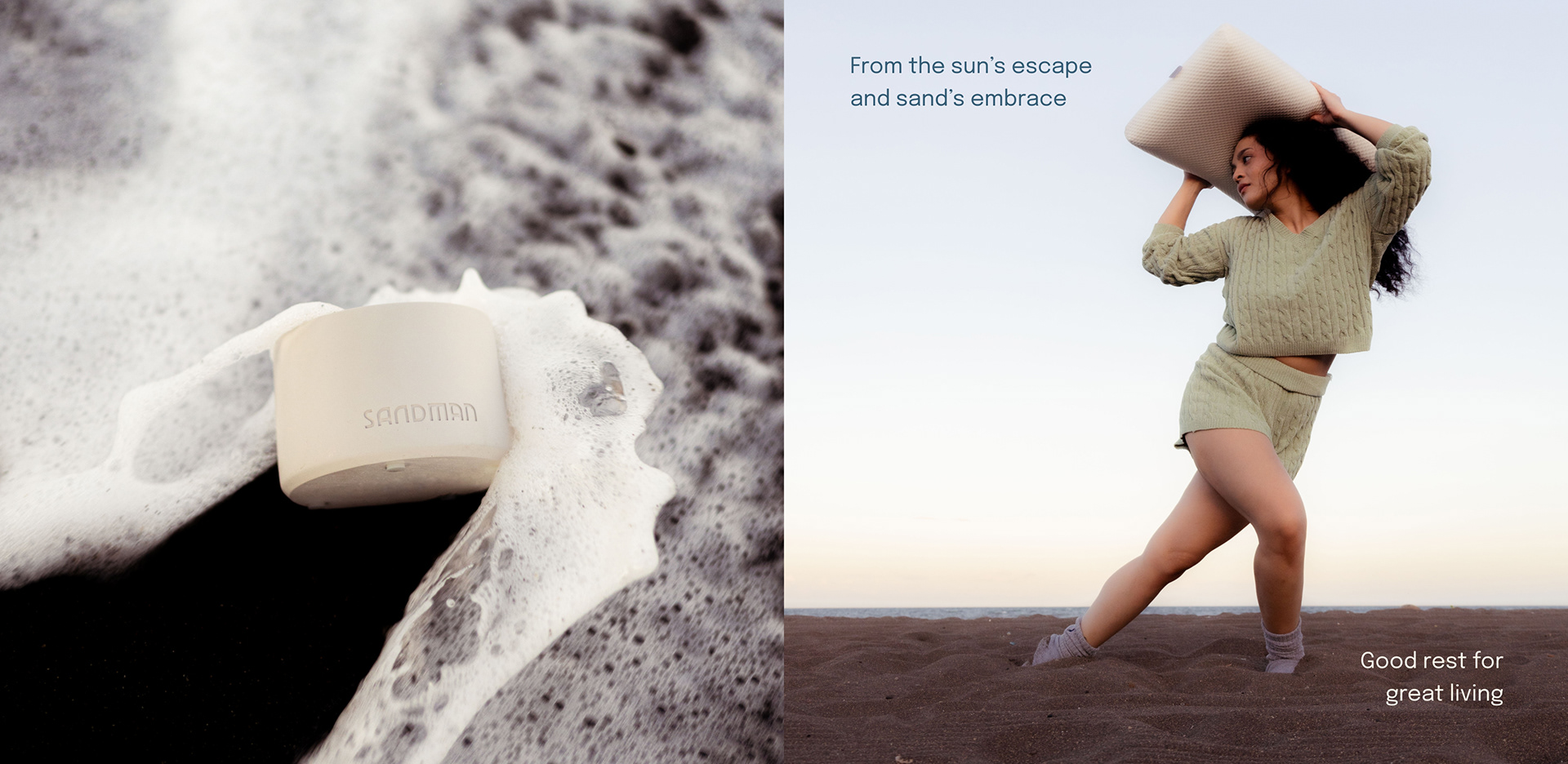
For this project, I crafted a key message that served as the anchor for the brand's core, "Good rest for great living."
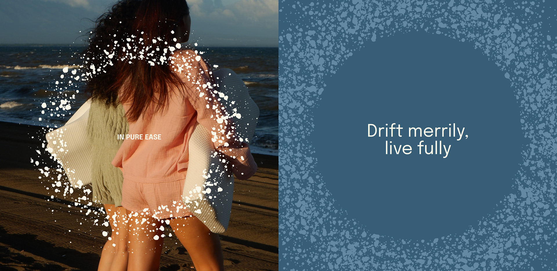
Colors — Inspired by the calmness of the sea, featuring soothing blues and warm cream tones with subtle secondary taken from soft colors you see early in the morning
Typography — A functional yet elegant sans font, designed to evoke a sense of calm and clarity.
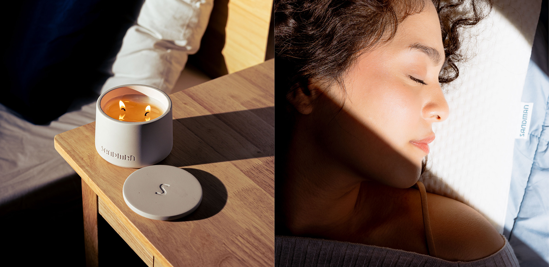
Key Visuals — Sand-like textures that reflect the essence of Sandman—grounding and timeless, symbolizing the natural flow into rest.
Logo — A custom wordmark crafted to redefine the sleep experience through comfort and innovation.
2024 — An independent branding project
Photography © Michael Perfecto and Abby Ng


