Reforma Studio is a reformer pilates studio designed to improve and redevelop your exercise habits by doing more for your body
2023 — An independent branding project
2023 — An independent branding project
Creative Direction
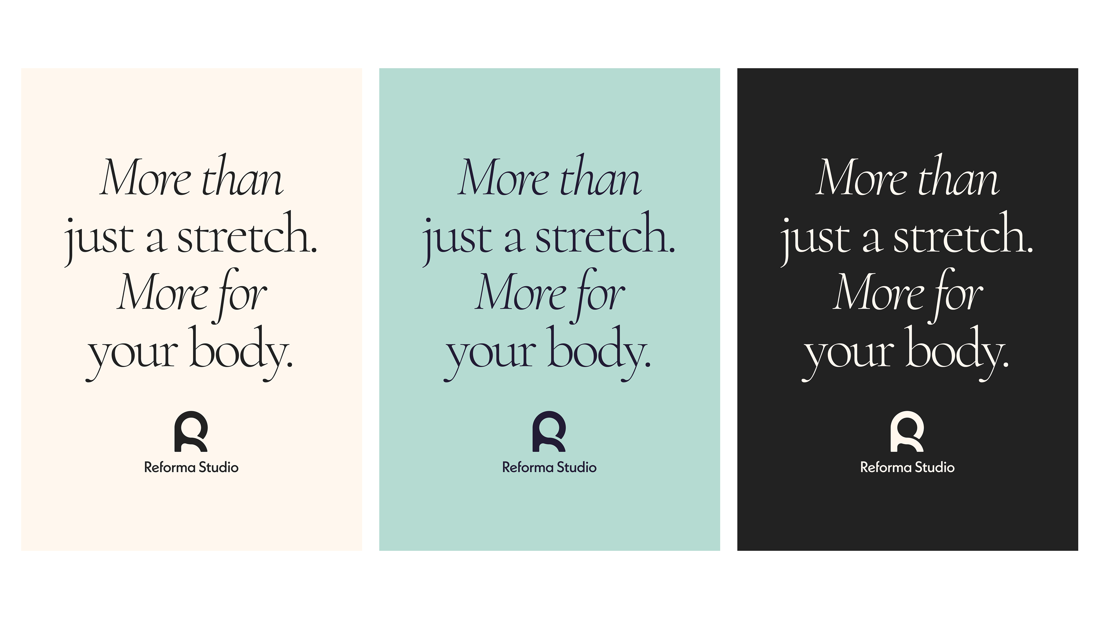
Reform your body, mind, and spirit through the power of Pilates. Reforma provides you the chance to give more to and for your body. My direction for the brand is grounded by the key message I provided them with, "More for your body."
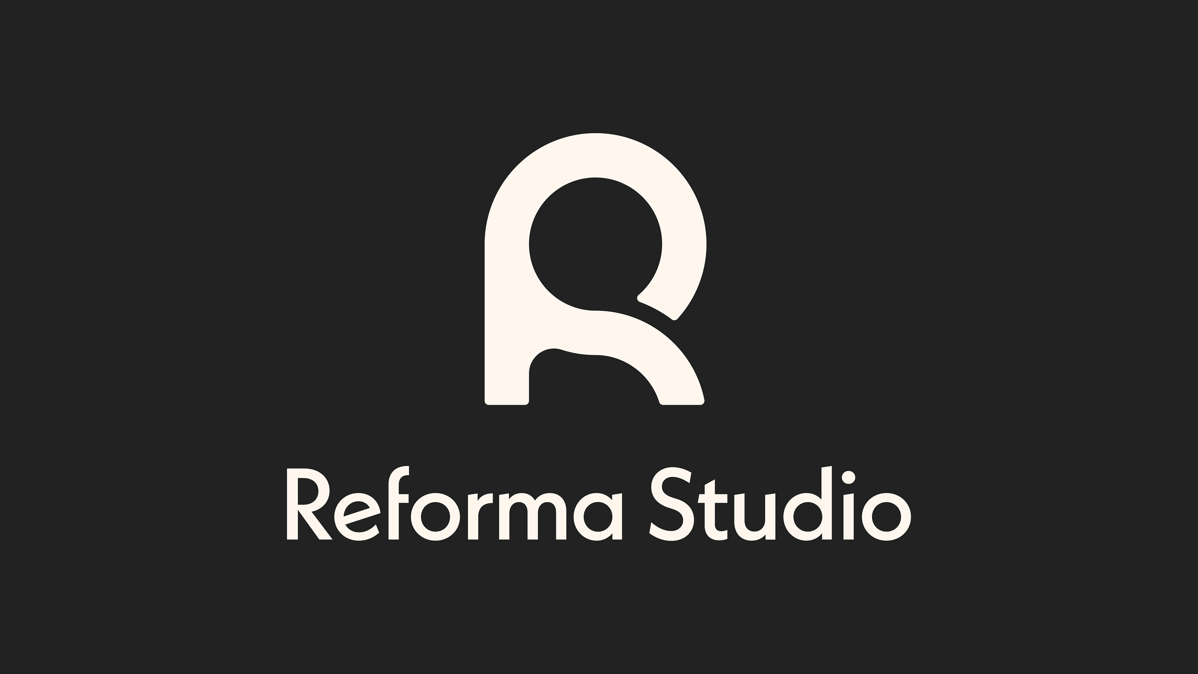
The logo takes inspiration from the mechanism of a reformer machine, the colors are an elevated take on black and white with a soft black and cream as our primary, and the typography is lifestyle centric made athletic with its’ play on form and slant.
BRIEF
Reforma approached me with the goal of making reformer Pilates accessible to all ages. Founded by two young women passionate about Pilates, they envisioned a brand that feels youthful, inviting, and seamlessly integrates fitness into everyday life.
APPROACH
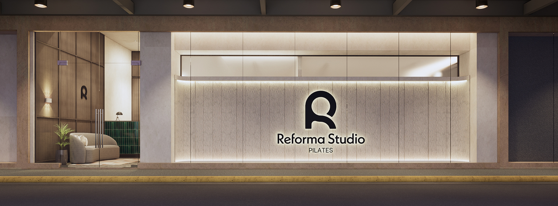
Logo — A contemporary geometric wordmark with subtle quirks embodies the athleisure aesthetic, while a symbolic “R” icon subtly nods to the reformer machine and Pilates practice.
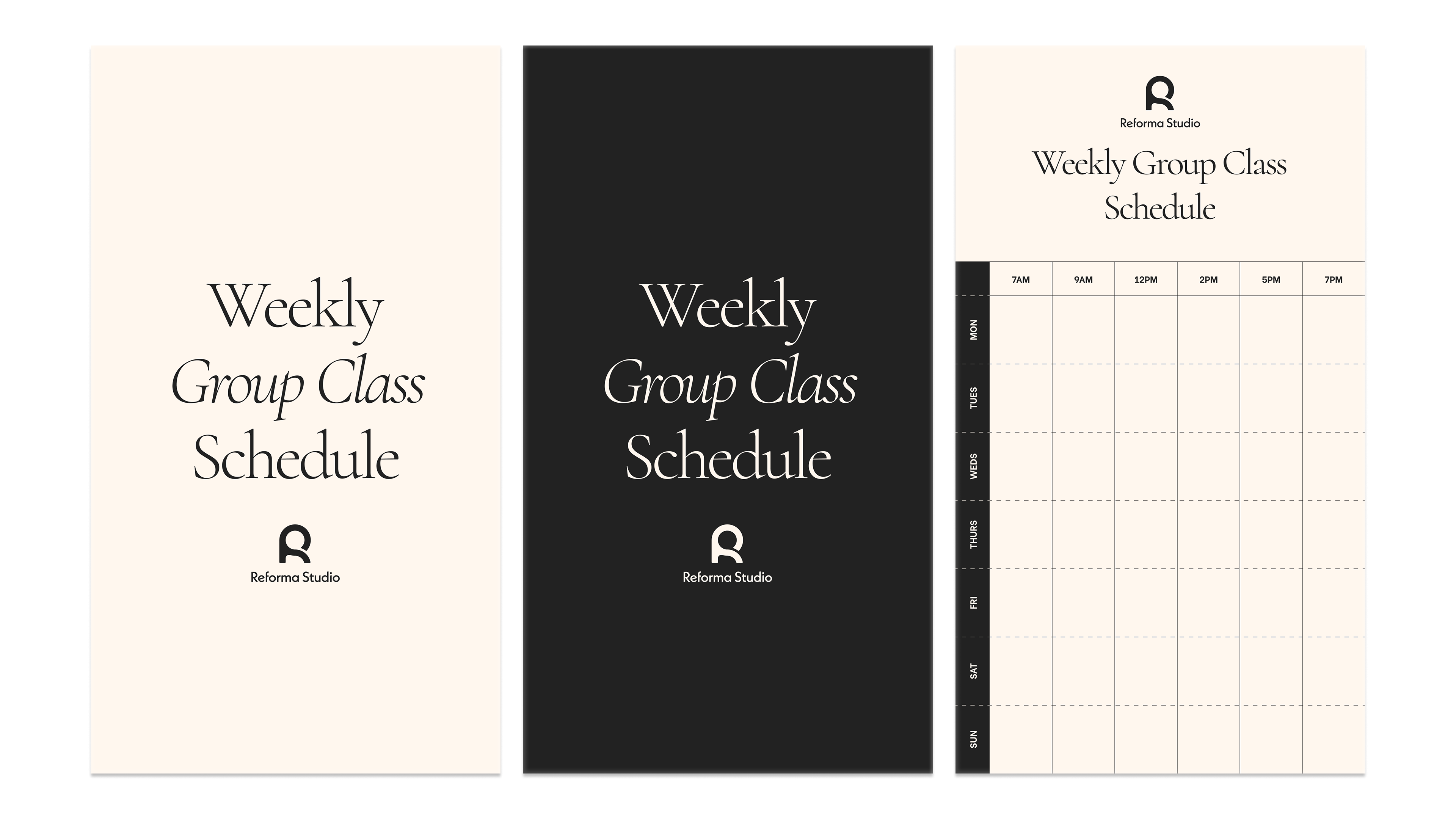
Colors — An off-black and cream color palette introduces a lifestyle-driven take on fitness, with vibrant accent colors adding energy and warmth.
Typography — A high-contrast, calligraphic serif font conveys grace and control, balanced by a modern, legible body sans that enhances clarity and approachability.
2024 — An independent branding project
Architectural Design & Render © Add Architecture


