Heyday was created in pursuit of making health and wellness viable, accessible, and enjoyable to Filipinos
2023 — Serious Studio as Lead Designer
2023 — Serious Studio as Lead Designer
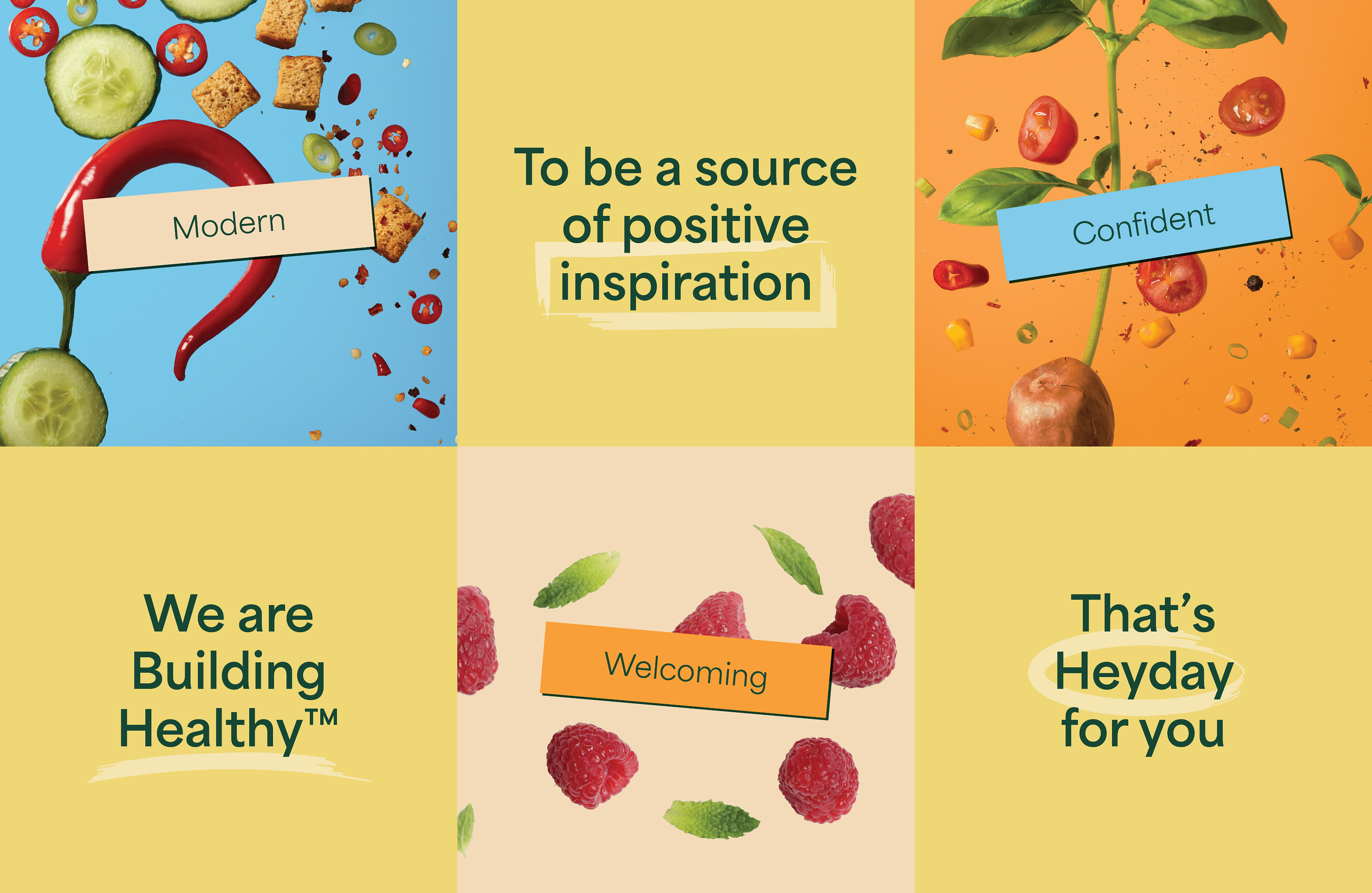
The future is inspirational and intersectional — and that starts with your Heyday


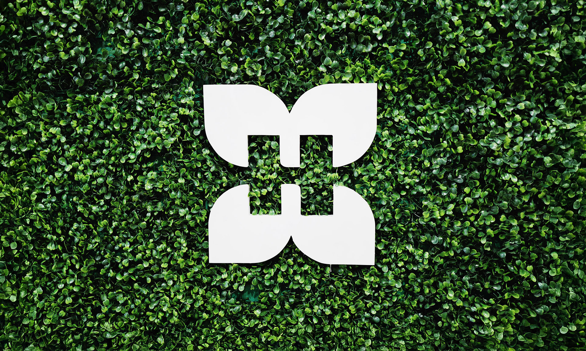
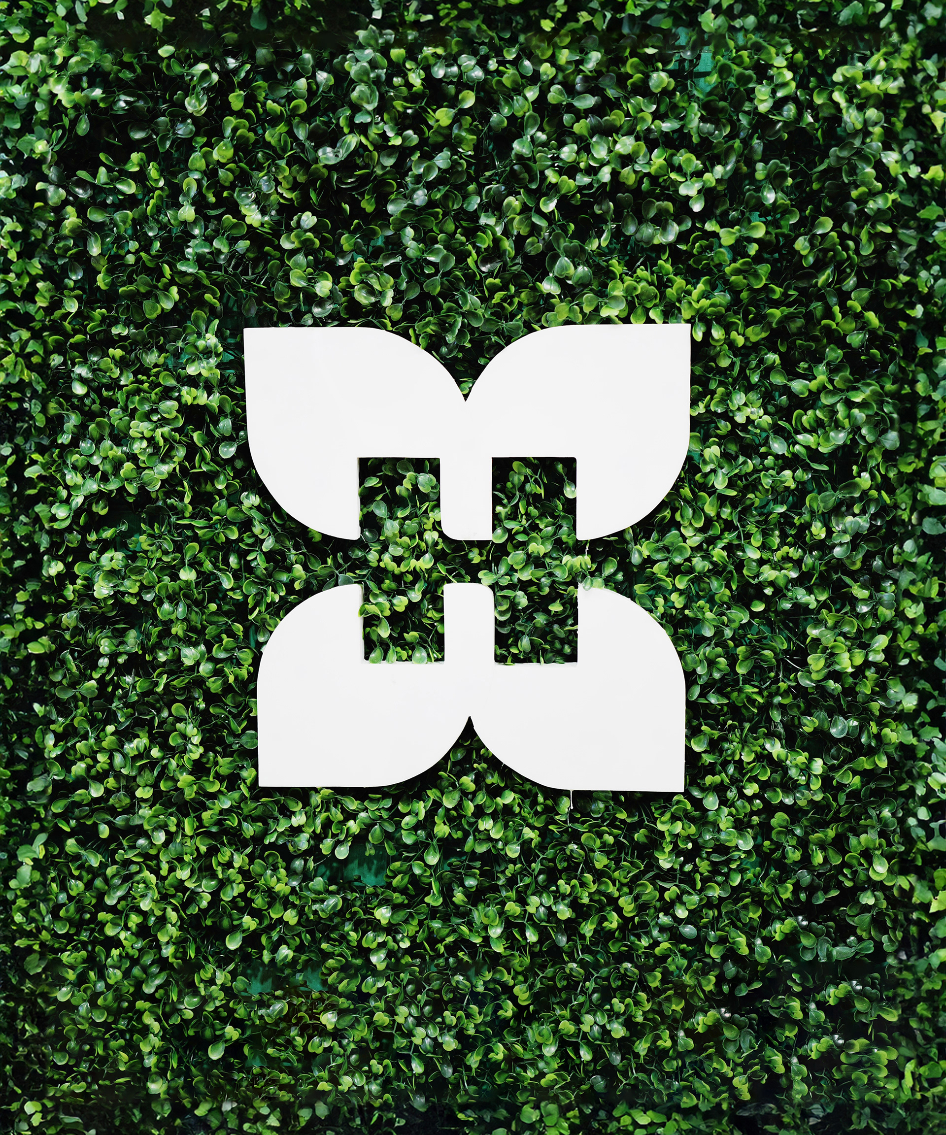
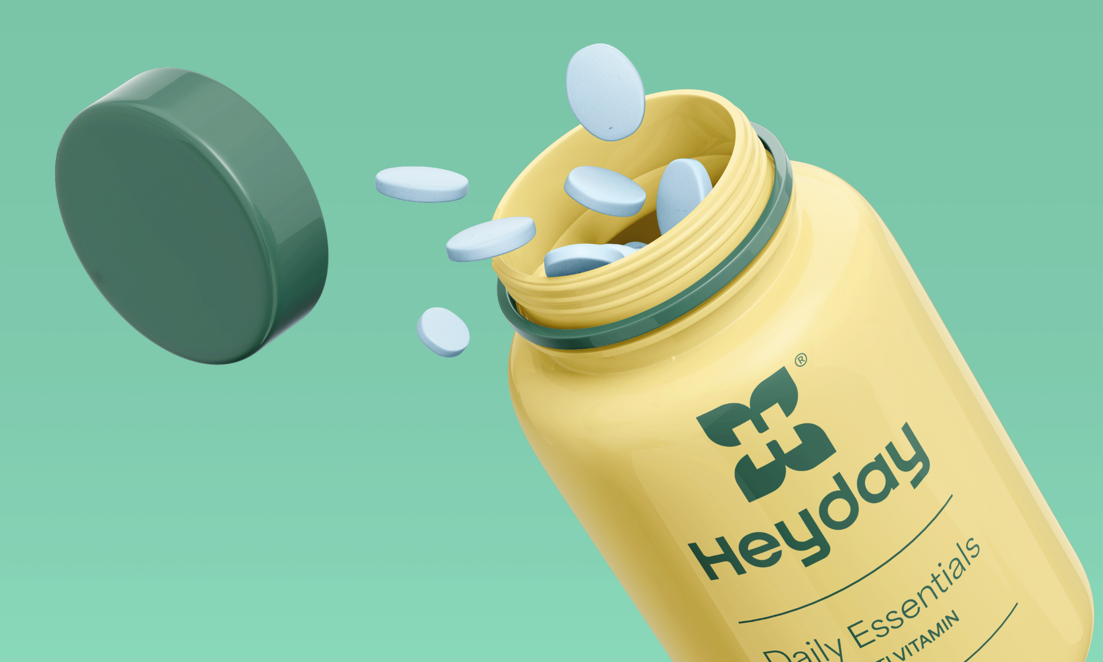
A logo based on our brand tone elements; sincere, social, steadfast, and secure—with Heyday at the center of a healthy heart, body, soul, and mind.
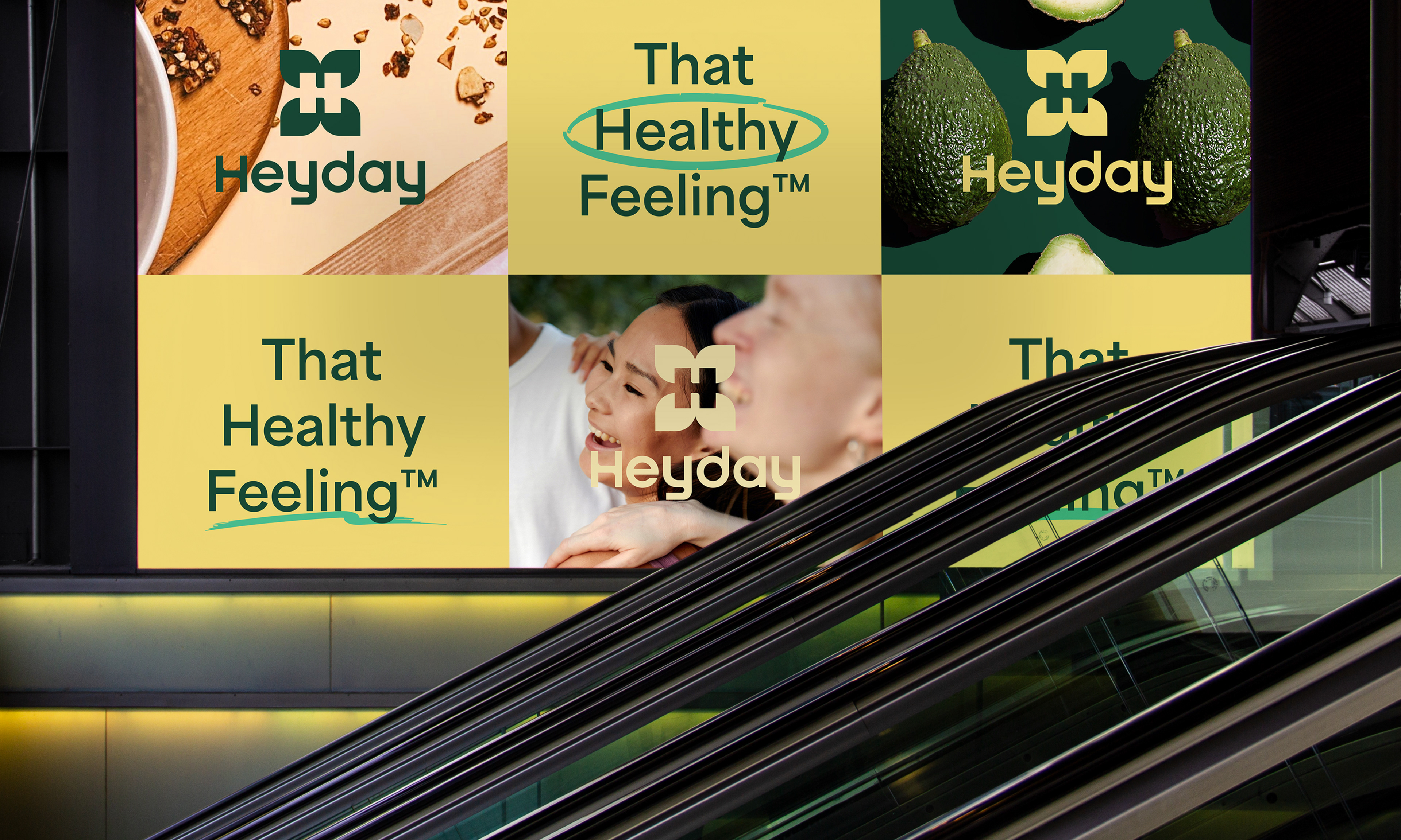
Colors and typography that are simple and optimistic, encapsulating the joy of practicing better health habits.
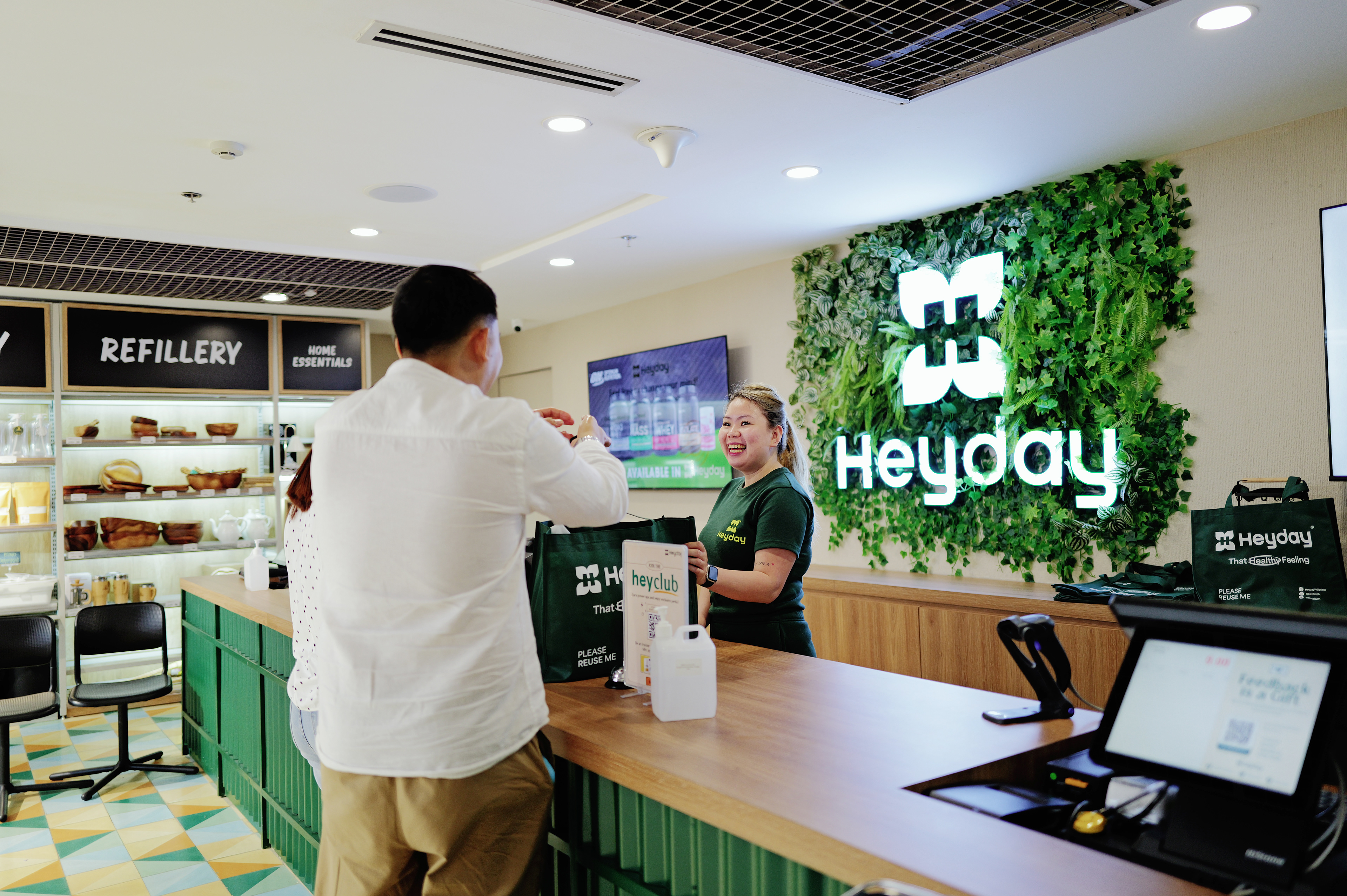
Photography that is clean, bright, and fun depicting health as a lifestyle.
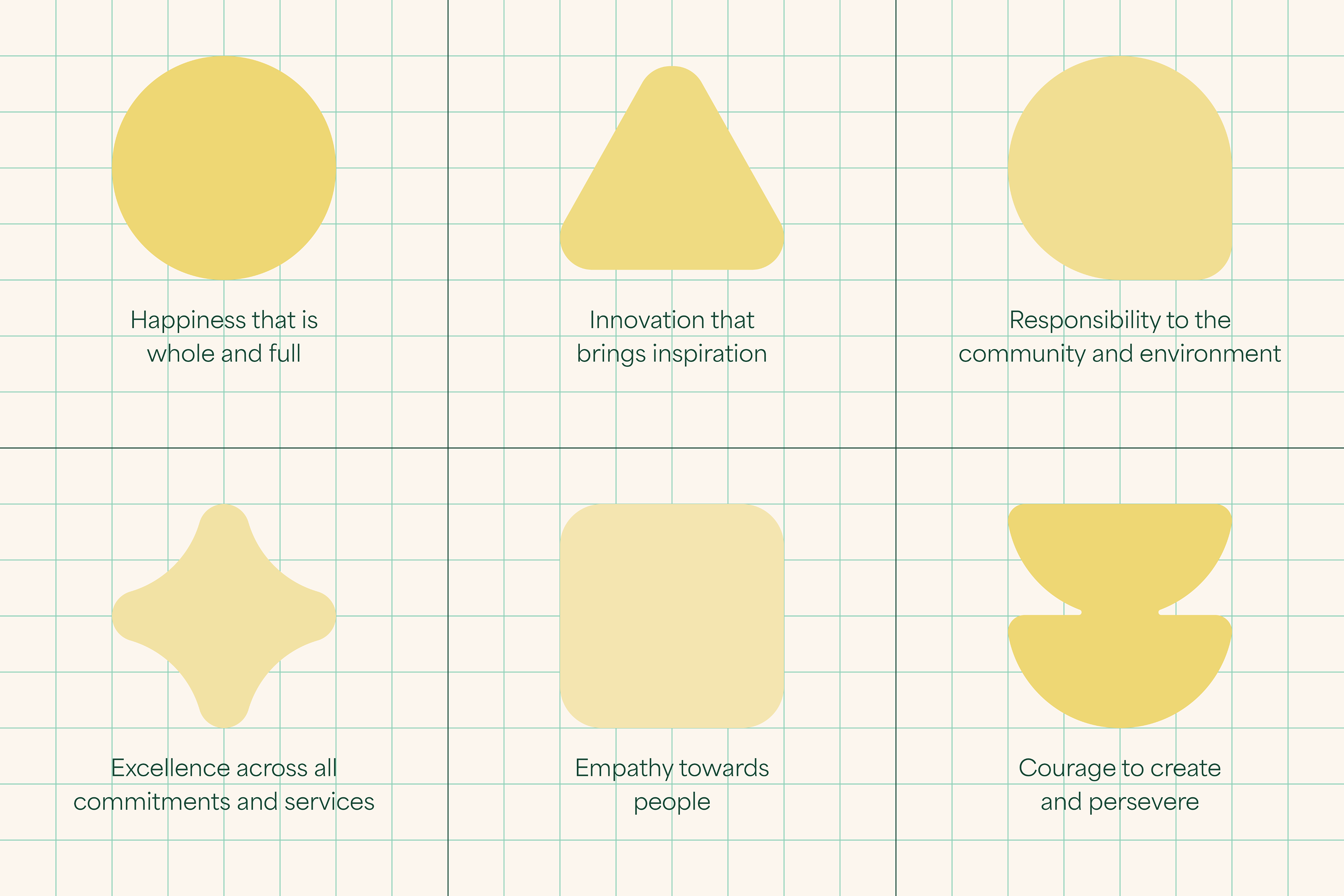
Key visuals embodying our HISPEC tone

Concept visuals by Serious Studio

Creative Direction
Heyday is a new business venture that aims to provide affordable, high quality products and produce to help Filipinos prioritize their health. Our creative direction conveys community, connection, and simplicity to reflect the modern grocer's concept of health and wellness. Our visuals embody warmth, care, and positivity because the future of health is inspirational and intersectional and that starts with your Heyday.
BRIEF
A brand identity made for the modern grocer in search of health at an accessible and affordable cost. The client wants a look that practices balance, restraint, and simplicity while conveying That Healthy Feeling™️
Approach
It all starts with color — Green and yellow to represent the nature of health and positivity in wellness made to energize and inspire, paired with secondary tones that are bright and uplifting.
Bringing joy to health — A clean and geometric sans with round and friendly curves, ranging in weights and styles.
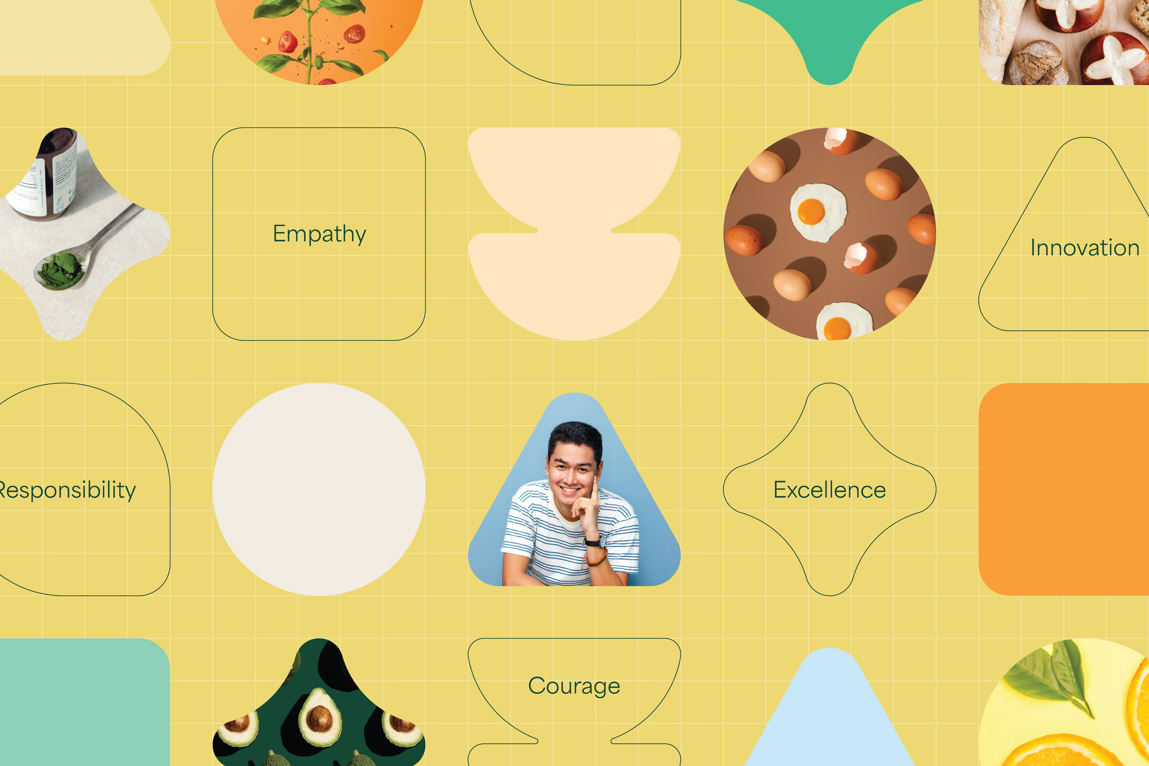
Building healthy with building blocks — Simple shapes that are welcoming and versatile to embody our HISPEC tone
Health as a lifestyle best enjoyed with good vibes — An approachable photography style capturing That Healthy Feeling in the best light. Images that feel like a good morning jog, a colorful plate of food, and the best group of people to motivate you.
The future is intersectional and inspiration, starting with your Heyday — A logo with an icon representing Heyday's intersectional approach to health and a complementary wordmark with contemporary letterforms following a consistent and cohesive "H."
2023 — Serious Studio as Lead Designer
Project Team
Project Team
Creative Direction by Lester Cruz
Brand Identity by Macy Escay and Denise Borja
Brand Strategy and tone by Ella Rivera
Project Management by Mayee Gonzales
Photography © Serious Studio


